
In this article:
SHARE THIS


A logo is often the first handshake between your brand and the world. It carries the weight of your reputation, communicates your values at a glance, and sets the tone for how customers perceive your business. But like any business asset, logos can lose their effectiveness over time if they no longer align with who you are or where you’re going. From shifts in technology to evolving customer expectations, there are clear signals that it may be time to refresh or completely rethink your visual identity. In this article, we’ll explore seven key signs that your logo may be due for an update—and how recognizing them can help keep your brand relevant, recognizable, and ready for the future.
Before diving into the key signs your logo needs an update, let’s talk about the drama surrounding the 2025 logo redesign that broke the internet.

Cracker Barrel, everybody’s favorite road trip pit stop, launched a “fifth evolution” of its brand logo in August 2025. The update removed the figure of “Old Timer” Uncle Herschel (the man sitting by a barrel) and the words “Old Country Store,” replacing them with a simplified text-only wordmark inside a barrel-shaped badge. This was part of a broader “All the More” modernization effort: refreshed interiors, updated menus, and a push to appeal to younger guests.
The redesign triggered immediate backlash, where customers felt the brand had abandoned its heart and narrative (not to mention the market fallout). Just days later, Cracker Barrel reversed course. In a statement, the brand affirmed, “We said we would listen, and we have. Our new logo is going away, and our ‘Old Timer’ will remain.” Cracker Barrel underestimated the emotional and identity equity stored in its iconic imagery. The chain’s swift brand misstep—and even swifter reversal—highlighted the importance of balancing heritage with modern aspirations, especially for legacy brands.
7 Signs It’s Time to Update Your Logo
1. It Feels Outdated
Design trends evolve. What looked modern 20 years ago may now feel clunky or dated. If your logo looks stuck in another era, customers may subconsciously perceive your company the same way.
2. It Doesn’t Work Well Across Media
Logos must be versatile—clear on a business card, bold on a trade show booth, and crisp in a tiny social media avatar. If yours doesn’t scale or loses clarity across formats, it’s limiting your brand reach.
3. It Doesn’t Reflect Who You Are Now
Companies evolve. Maybe you’ve expanded into new markets, adopted new technologies, or shifted your focus. If your logo still reflects the “old you,” it’s time for a reset.
4. Customers Don’t Recognize or Connect With It
If your logo isn’t memorable, fails to stand out, or no longer sparks recognition among your target audience, it’s not doing its job.
5. It’s Generic
A logo should be distinctive and ownable. If your mark looks interchangeable with competitors—or relies on overused industry clichés (like gears or factory silhouettes)—it won’t differentiate you.
6. Brand Alignment Issues
When your messaging, marketing, and customer experience lean toward innovation and growth, but your logo feels static or outdated, you have a disconnect that undermines your credibility.
7. Strategic Inflection Points
Mergers, acquisitions, new product lines, or entering new markets are natural moments to re-examine whether your logo supports your strategic vision.
These signs aren’t just theoretical—they play out in the real world every day. Some of the most recognizable industrial and manufacturing brands have faced the same challenges and made deliberate choices to evolve their logos. Whether it was about simplifying for digital use, signaling innovation, or staying competitive in a changing market, their logo updates became milestones in their brand story. Let’s take a look at how one company navigated this process and what its evolution can teach us about recognizing the right time to make a change.
Case Study: Caterpillar
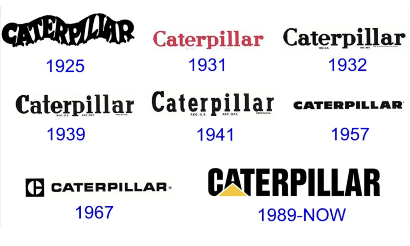
The challenge: Their original wavy logotype was too decorative and didn’t scale well. As the company grew globally, the mark no longer reflected the strength and clarity of the Caterpillar name.
The evolution: Over decades, the logo became bolder, simpler, and more distinctive—culminating in the iconic “CAT” wordmark with the yellow triangle.
The takeaway: Caterpillar recognized when its logo was out of step with its business strategy and proactively modernized. Today, the CAT logo isn’t just recognizable—it’s a global symbol of strength, stability, and progress.
Case Study: Rockwell Automation
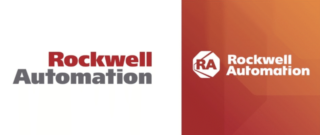
The Challenge: Rockwell Automation, a global industrial automation and information company, needed a logo that could reflect its cutting-edge technology solutions while still honoring its legacy in manufacturing and automation. Its prior branding felt static and overly industrial, which limited appeal to digital-age audiences.
The Evolution: The new logo incorporates a modern sans-serif typeface with a dynamic symbol that evokes motion and connectivity. The design is simplified, versatile, and visually represents automation, control, and innovation. Color accents were updated to reflect energy, precision, and technological excellence.
The Takeaway: Rockwell Automation’s logo now communicates innovation, flexibility, and a high-tech approach while maintaining trust and reliability associated with its industrial roots.
Your logo doesn’t just represent your company—it represents your evolution, your ambition, and your promise to the market. Recognizing when it no longer serves that purpose is a sign of growth, not failure. By paying attention to these seven signals, you ensure that your visual identity evolves in lockstep with your business strategy and customer expectations (😬 looking at you, Cracker Barrel). And as countless companies have shown through successful logo evolutions, a well-timed refresh isn’t about abandoning your past—it’s about equipping your brand to stand strong and resonate in the future.
Share this article with your network.